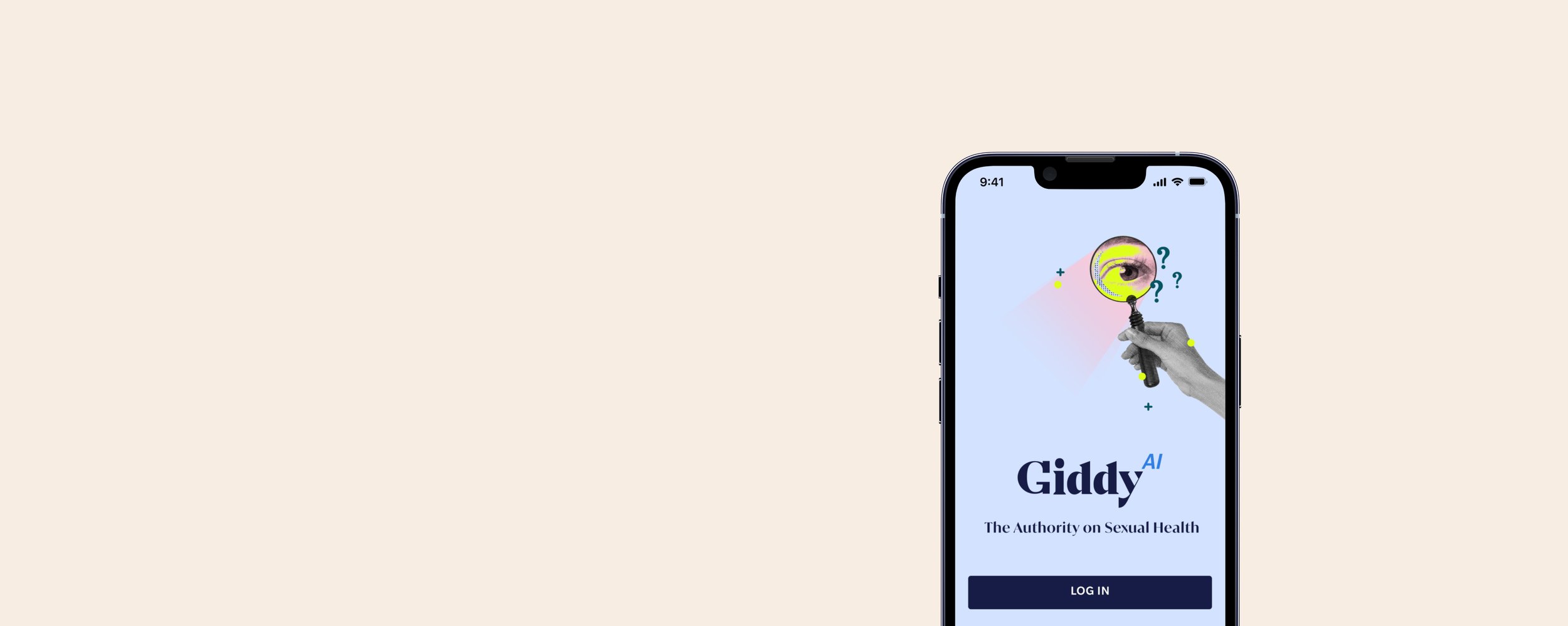
GiddyAI
Objective
A project to create an AI-driven app for a safe, non-judgmental space where individuals access accurate sexual health information and ask questions. | Giddy is launching an AI-powered App with a vast library of articles and resources to provide a safe space for users to ask any question, including sensitive ones. The App will offer informative support for users with whatever they need.
My Role
Research Support
Designer
Tools
Figma
Teams Involved
Design, Editorial, SEO, Marketing, Dev, Copy
Duration
4 Month Sprint
Overview
We believe that everyone deserves access to accurate and reliable information about sexual health. That's why we're proud to offer an innovative platform powered by AI technology, designed to provide users with a safe and welcoming space to ask any questions they may have. No question is too big or too small, and our advanced algorithm is dedicated to providing personalized guidance and resources to help users make informed decisions about their sexual health and well-being.
With the world's largest sexual health platform at our disposal, we're able to draw from over 8,000 articles to provide users with the most up-to-date and evidence-based information available. Whether you're looking for information about contraception, STIs, or sexual pleasure, GiddyAI has you covered. Our app is user-friendly and discreet, with privacy and confidentiality being our top priorities.
We believe that promoting sexual health education and awareness is key to empowering individuals and communities around the world. With GiddyAI, we're committed to breaking down stigmas and taboos surrounding sexual health, and providing a supportive and non-judgmental environment for individuals to learn and grow. Join us in our mission to revolutionize sexual health education, and download GiddyAI today.
Research
C&C Analysis
GiddyAI is at the forefront of innovation in the market with no direct competitors. To ensure that we are providing the best possible experience for our users, we drew inspiration from industry-leading apps. We analyzed and broke down the best features of apps like Tumblr, Gmail, Facebook, and WebMD's Symptom Checker and more to create a unique and comprehensive solution for our users.
Interviews
We took a proactive approach to engage with potential users even before our app was available. Through social media and dedicated groups, we were able to conduct in-depth interviews with 8 individuals who showed interest in using our app. Ranging in age from 24-35, these individuals shared their thoughts on AI technology, their understanding of sexual health, and their methods for researching and finding information on the topic.
Takeaway
“I get scared going to WebMD because It gives me the worst possible scenario for what is going on.”
-Interviewee
Findings
“I don’t always ask my Dr. right away because its embarrassing.”
“I want it to look and feel trustworthy but also fun and engaging.”
“I don’t want to feel pressured or scared when researching about what I may have.”
“AI feels human but it’s not, I ask chatGPT embarrassing questions all the time.”
“I enjoy subtleness, I’d like to not worry about where I can use this especially with the subject matter.”
“We need more resources to talk to a Dr. get a prescription, etc…”
Persona
Lila Rodriguez
30 years old
Young Professional
Lots of anxiety surrounding her body
Lila is a driven young professional who is navigating the dating scene. Though she is on birth control, she sometimes forgets to prioritize protection in the heat of the moment. After one of these experiences, Lila wakes up feeling worried and uncertain about her sexual health. She is searching for an app that can provide her with quick and reliable answers to her questions, without the fear and anxiety that often comes with discussing sexual health with a doctor. Lila wants a safe and secure space where she can access the information she needs to feel confident and informed about her sexual health and work up the courage to schedule an appointment with a Dr.
"How might we empower individuals like Lila to feel confident and informed about their sexual health, by providing a safe and secure platform for quick and reliable answers to their questions, without the fear and anxiety often associated with discussing sexual health with a doctor?"
Design
Sketching
Now that we had Lila we were eager to explore new design concepts and push the boundaries of what was possible. After a flurry of rapid sketches and brainstorming sessions, we honed in on a few standout ideas that we were particularly excited about.
Splash / Login
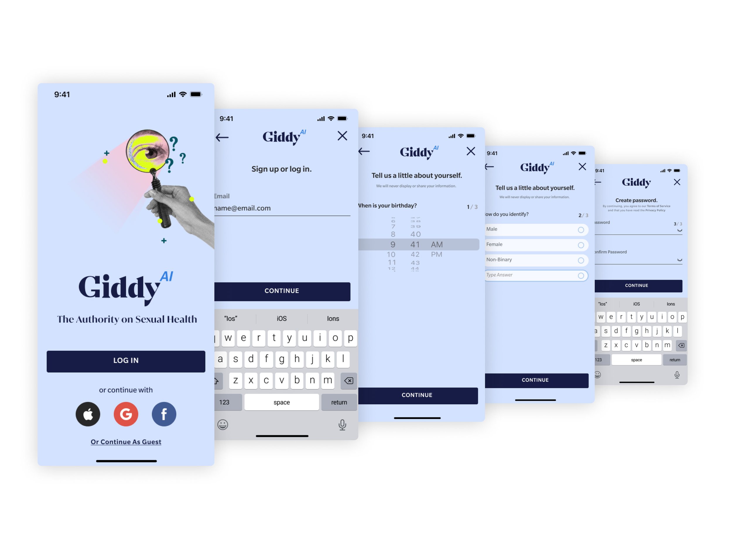
For the splash screen, knew we wanted to strike a balance between simplicity and functionality. While offering the option to continue as a guest, we also wanted to encourage users to create an account for a more personalized experience. We sketched a large login button and smaller social media login options at the bottom. Additionally, we knew we wanted to include a more discreet option for those who preferred to continue as a guest.
Homepage
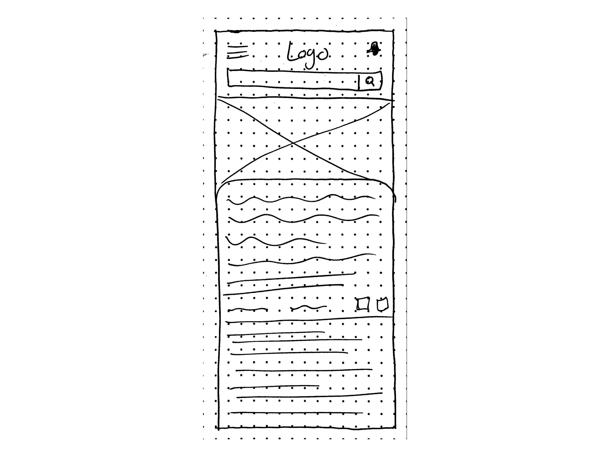
The centerpiece of the page had to be a prominent search bar, which serves as the cornerstone of the GiddyAI app. To enhance the user experience, we also thought about how we could include a sliding card at the bottom that provides quick access to notifications and popular topics keeping anything that could be potentially sensitive away from site to keep a discreet design.
Results
The results page is a critical component of the GiddyAI app, as it displays the answers to users' questions. To ensure a more discreet design, we aimed to strike a balance between simplicity and detail. The main answer card is prominently displayed to emphasize its importance, and after a few seconds, the rest of the page is revealed to provide additional information and reveal what could potentially be a little more personal or confidential.
Artcile
As GiddyAI is an extension of GetMeGiddy.com, it was crucial for us to ensure seamless integration of our articles into the app. After a lot of thought, we envisioned a sleek and intuitive card-like design that would present articles to the user. The design allows for an effortless transition and can be slid away from view if need be, offering a discreet and non-intrusive experience for users who may be reading sensitive content.
Glossary
Getmegiddy.com required a comprehensive glossary page to serve as a one-stop shop for all topics covered on the site. For the app we designed the page with a user-friendly approach, incorporating both a topic search bar and an alphabetical slider for easy navigation. The design mirrors that of the Giddy website, ensuring a seamless experience for users as they explore and discover.
Profile
For the profile page, we aimed to strike a balance between simplicity, functionality, and discreetness. Our goal was to provide users with a user-friendly interface that holds a wealth of information, without overwhelming them. To achieve this, we considered incorporating tabs to categorize and organize the information, making it easy for users to find what they need and make changes to their account if needed.
Notifications
For our notifications, we faced a challenge but eventually drew inspiration from the Apple notifications system. Our notifications are neatly stacked together, categorizing them according to type, such as breaking news or profile related. The user can easily expand each notification to view more details within that category while also keeping most of them hidden which was important in case any sensitive topics were to be shown.
Where We Landed
Wireframes
Having honed in on a design that truly embodies the vision for GiddyAI, we set out to bring our concepts to life in high-fidelity. This phase involved expanding upon the wireframes, delving deeper into the user journey, and exploring the many nuances of the app experience. Our goal was to create a detailed and immersive representation of the app that would effectively communicate our vision to stakeholders and bring the design to life in a meaningful and impactful way.
Splash / Login
Designing the splash screen and login process presented a unique challenge, as the app must adhere to Apple's app store guidelines, which do not permit mandatory login requirements. Our goal was to create a seamless and efficient user experience, without sacrificing the security and personalized benefits of a user account. To strike this delicate balance, we devised a streamlined 4-screen account creation process. This design decision ensures that users have a smooth and hassle-free experience. While we couldn’t require an account there are specific parts of the app the user cannot engage with while viewing the app as a guest.
Homepage
Upon logging in, users are greeted by the discreet and minimal homepage of GiddyAI, featuring a prominent search bar as its centerpiece. To enhance the search experience, we offer a curated selection of questions that dynamically appear as the user types, providing guidance and suggestions along the way. At the bottom of the screen, a "Breaking News" bar keeps users informed of the latest developments in sexual health and wellness, mirroring the design of the corresponding feature on GetMeGiddy.com. Below this, a popular topics card can be accessed, offering a wealth of articles, videos, and other resources for users to explore and discover the full potential of the app.
Results
When a user poses a question to GiddyAI, the app presents the most relevant information on the topic in a clean and intuitive manner. Our design considers the varying amounts of information available for different topics, ensuring that the presentation remains sleek and visually appealing regardless of the subject matter. The information is revealed in a way that the title cards appear first and the rest of the information follows a few seconds later in a well-paced and visually harmonious manner.
Artcile
As articles are the backbone of GetMeGiddy.com, it was essential for us to seamlessly integrate them into the GiddyAI app. These articles offer a wealth of information and knowledge, serving as a valuable resource for users seeking answers to their questions. To maintain consistency with the rest of the app, we opted for a sleek and intuitive card-like design, allowing users to easily swipe away any content that may be sensitive or inappropriate in public settings. This design choice reflects our commitment to delivering a seamless and user-centered experience, while also ensuring privacy and discretion.
Glossary
The glossary within the GiddyAI app offers a unique and enhanced experience, with features that distinguish it from the GetMeGiddy website. To make navigation and searching effortless, we designed a user-friendly search bar and an intuitive alphabetical slider. During our discussions with stakeholders, we recognized the importance of providing logged-in users with the ability to save and follow specific topics. To deliver on this, we incorporated an ellipses button next to each topic, allowing users to effortlessly add/remove topics to their preferences and create a personalized experience.
Profile
The design of the profile page was a key focus as we moved from sketches to a fleshed-out design. Our aim was to create a visually appealing and functional page that provided users with a comprehensive view of their preferences and interests. We carefully considered the appearance and functionality of each tab making them sleek and concise and refrained from making anything too bulky. Additionally, we explored the possibility of gathering more information on users through a quiz, which would allow us to deliver a truly customized and tailored experience.
Notifications
The design of the notifications section remained consistent throughout the design process, as we worked to refine and enhance our wireframe. The stacked look was retained, offering a clear and organized view of incoming notifications. To ensure that users have complete control over their experience, we also developed filtering options, giving users the ability to turn on and off specific notification groups with ease. This design decision empowers users to customize and avoid any unwanted notifications, creating a truly personalized and more discrete experience if they choose.
Testing / Prototype
With the release of GiddyAI, we are dedicated to continuously improving and optimizing the app through testing. Our current focus is the development of version 0.2, which will undergo extensive testing in the coming months. From the outset of the design process, we adopted a philosophy of minimalism, seeking to create a simple and intuitive, and discreet user experience. However, as we gather more insights through testing, we are poised to expand and evolve the app, adding features and functionality based on the needs and preferences of our users. The journey of GiddyAI is one of constant growth and improvement, driven by a commitment to delivering the best possible experience for our users and helping them feel confident in their sexual health needs.
Next Steps
Continue to build and test GiddyAI 2.0
We want to make the AI more personable and offer more solutions as we build on the possibilities of GiddyAI
Integrate more options for users to schedule appointments with doctors and experts.
Key Takeaways
Building an app was no easy feat, especially with the content that surrounds all of Giddy. We want to continue to make the world of sexual health less and less taboo.
Insights
AI is an amazing tool that can help people no matter what the subject matter is.
Challenges
AI is becoming the forefront of our day to day, and learning how to build an app around machine learning and sexual health With an added layer of discreetness was very difficult but very rewarding.
Favorite Step
Coming up with the visuals of the app and how it was going to be cohesive with the rest of Giddy but keeping it fresh and different as well.


